B2B e-commerce Redesign
Overview
For a client, I redesigned an B2B e-commerce shop in the construction industry.
I was responsible for an analysis of the status quo of the shop as well as competitors, the identification of the most important areas of improvement, conception of solutions (on wireframe basis), hand-off to UI-Design, review of UI and final hand-off to our client.
Phase 1: Analysis
Workshop
In a joint workshop with our client, we gathered the shop's USPs and relevant goals. By prioritizing the USPs and identifying the most important business goals, we were able to define a strategy and create a common understanding of the next steps.
Goal
With our customers' current shop, business goals in the areas of increasing purchase value and increasing purchase conversion of registered customers were not achieved. The goal was to identify and improve key areas of the user experience.
Review of Status Quo
With a focus on the goals we had set, I analyzed the current shop in collaboration with a colleague.
The shop already had many target group-relevant functions in the account area, but the overall user experience was unnecessarily complicated by inconsistent interactions and overly complex structures.
I identified key areas to enable a smooth and goal-oriented user experience: consistency, clarity, and predictability.
Competitor Analysis
In order to identify industry standards and opportunities for differentiation and improvement for our customers, I analyzed the shops of three relevant competitors and came to the following results:
Industry Standards
Very similar sorting and grouping of product categories across different competitors
Well-structured brand pages for relevant and well known brands such as Bosch, Hilti etc.
Clear communication of offers in terms of duration
Opportunities to Stand Out
Improved navigation and user guidance through the product range so that products can be found and added to the shopping cart quickly and easily
Different target group-relevant entry points into the product range
Clear communication of USPs, product range and features
Part 2: Prioritization of Areas of Improvement
Based on the Analysis we were able to identify some Quick-Wins and gather important areas of improvement. The client was able to tackle the Quick Wins immediately. For the bigger improvements we prioritized the areas with regard to the business objectives. We committed to these 4 for the next phase:
1. Optimize Navigation
Clear structure and user guidance
2. Clear communication
Clear communication of USPs, product range and features
Communication of benefits regarding registration
3. Optimized user flow
Improved user guidance through the product range
Different target group-relevant entry points into the product range
4. Presenting product brands more prominently
Creating brand pages for the most relevant and well known product brands
Part 3: Creating Wireframes
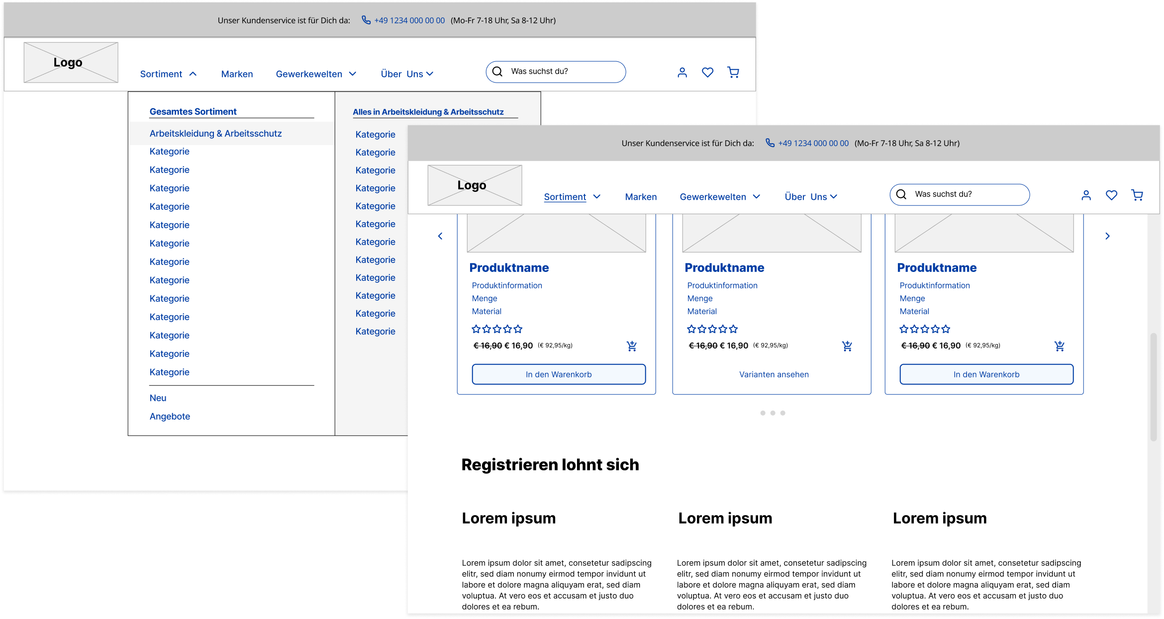
Optimized Navigation
Clear structure, shop and account functions are clearly separated
The product range can be accessed via the menu down to the second level (for faster access to the products)
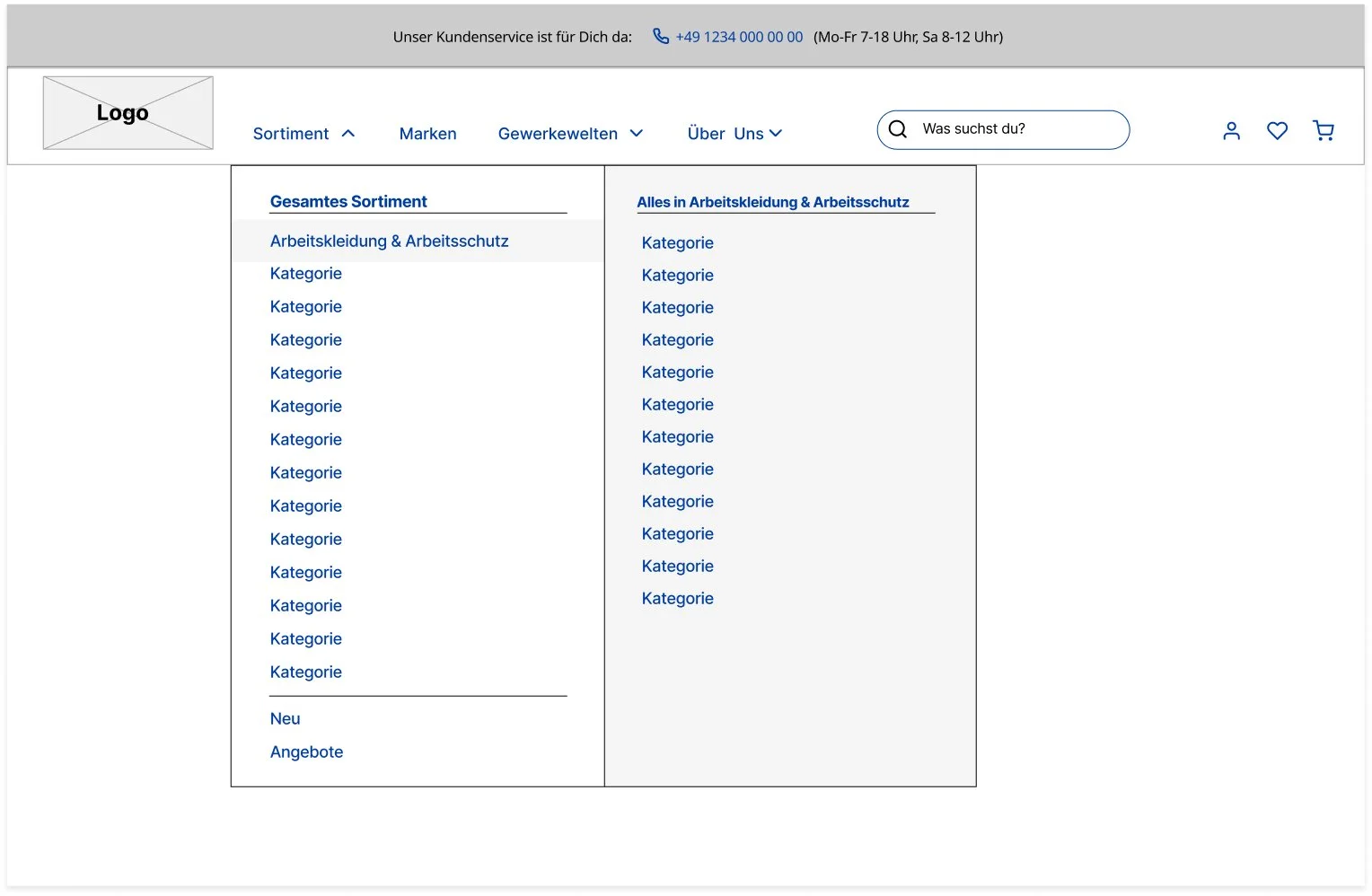
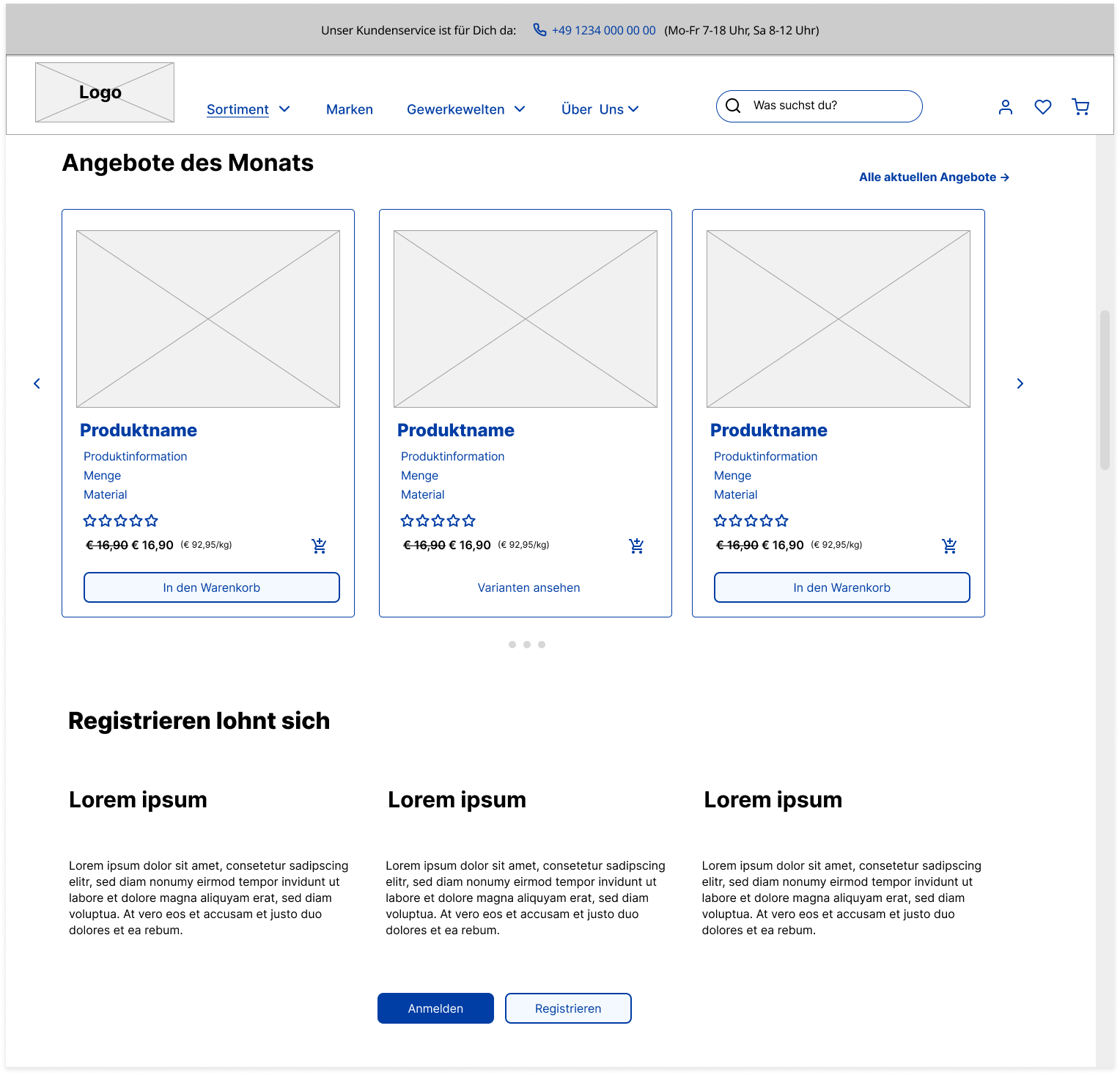
Clear Communication
Clear communication of USPs
Prominently placed communication of USPs, product range and benefits of registration on the homepage
The service hotline is integrated into the header (as the personal service is one of the USPs of the shop)
Prominent targeting of specific groups
Different user groups are addressed on pages for thematically grouped trades.
Target group-relevant context can be placed on these pages, and users can be directed to relevant areas of the product range.
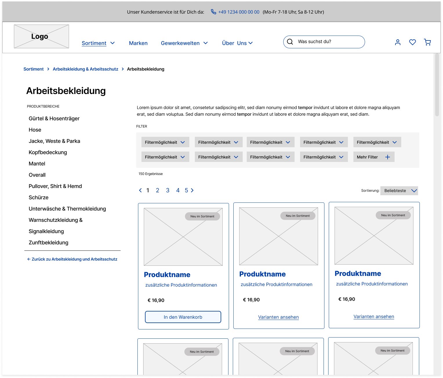
Optimized User Flow Trough The Product Range
Subcategories of the productcategory at hand are always visible to the left so navigating deeper into the product range is easily possible.
“Zooming out” and going back to the last higher category is always possible trough a link beneath the listed subcategories. User who scan the subcategories and realize they might be in the wrong category will automatically see the “going back” option.
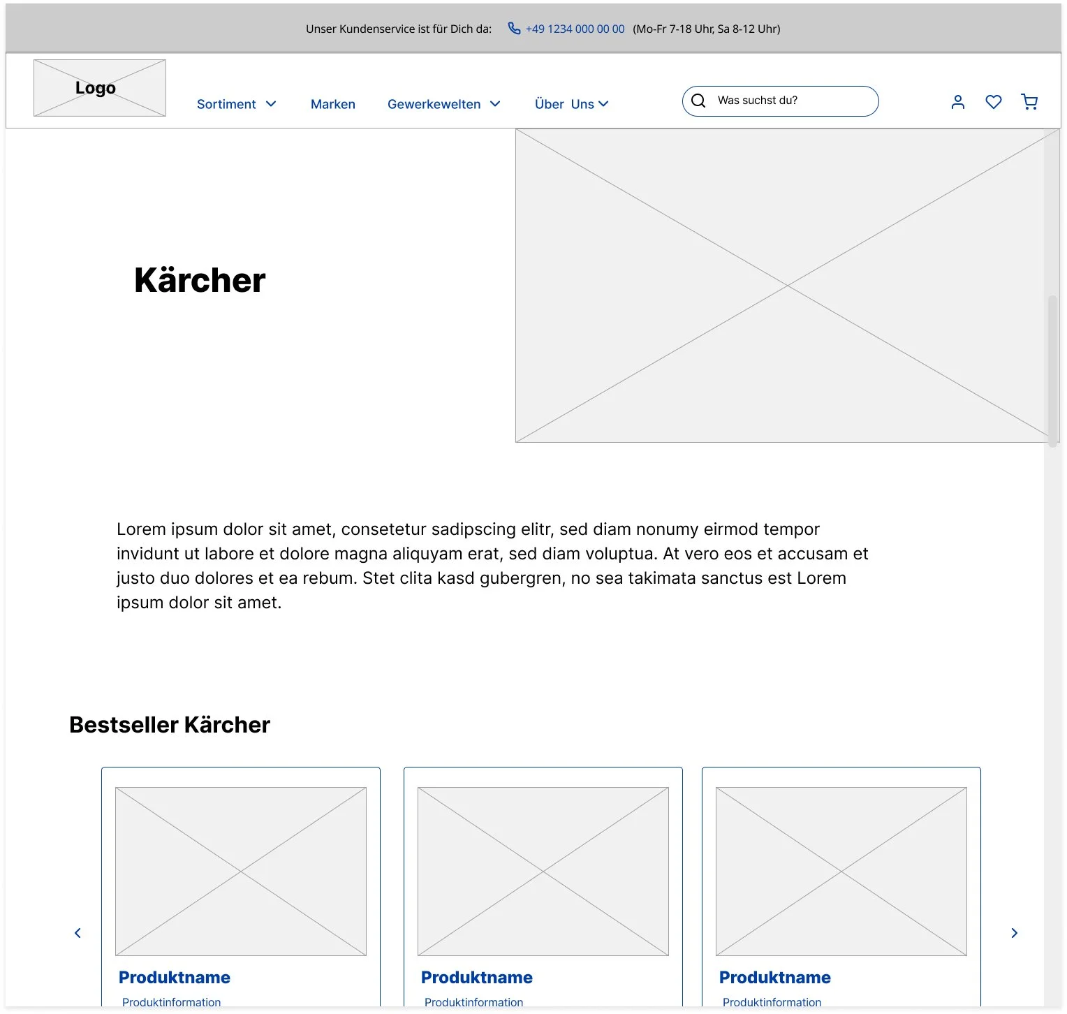
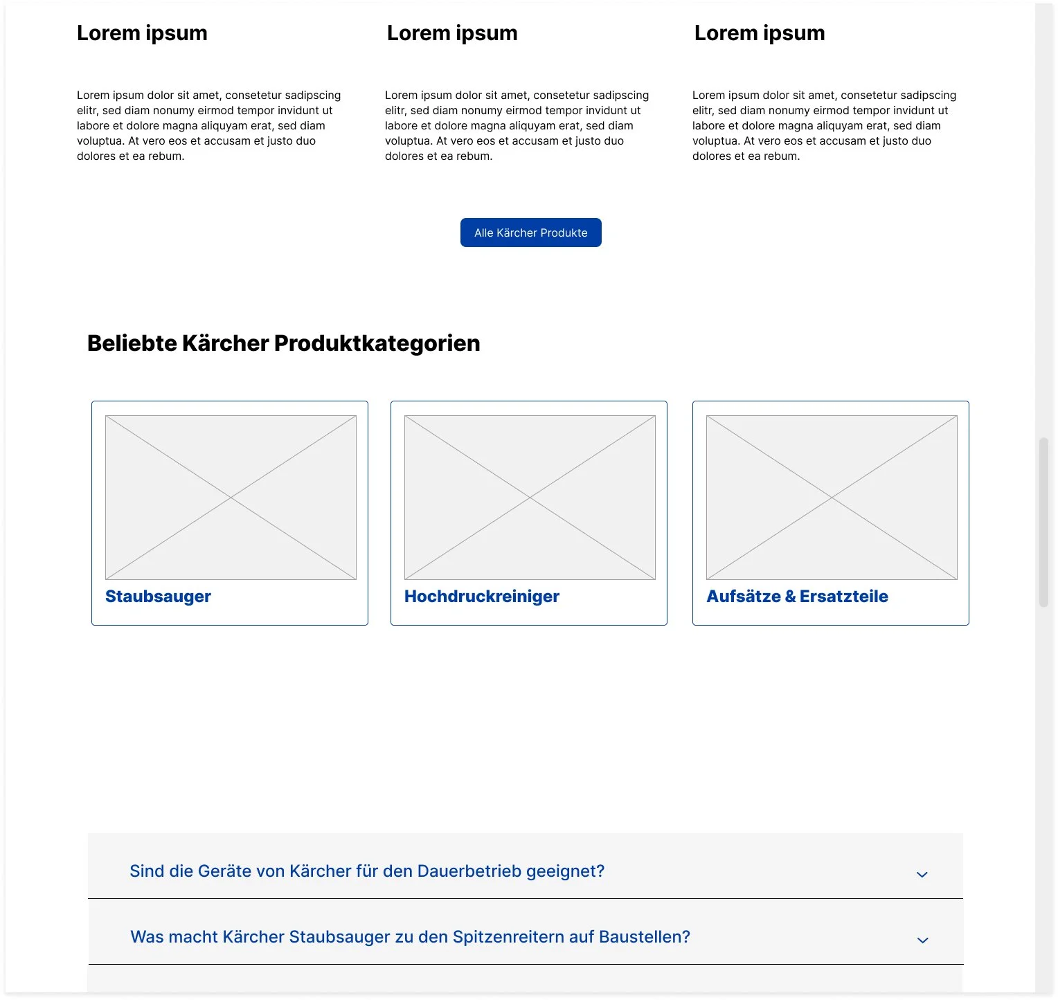
Presenting Product Brands Trough Brand Pages
Stronger brand visibility: Dedicated brand pages make brands stand out clearly and improve recognition.
Trust & credibility: Brand information, expertise, and quality signals provide context beyond products and build trust.
Guided product discovery: Curated assortments lead users directly to relevant products.
Confident decisions: Combining brand storytelling with products supports faster, more confident purchasing.
Collaboration & Next Steps
This project was developed in close collaboration with a dedicated UI designer, who was responsible for creating detailed design mockups that translated the concept into a clear and consistent visual language. At the time of writing, the client is actively implementing the full set of proposed changes, bringing the improved experience into production and validating the design approach.